Behr
The coming year’s hottest shade isn’t actually hot at all. Nope, it’s the calm, cool Classic Blue—Pantone’s much anticipated 2020 Color of the Year.
Leatrice Eisman, executive director of the Pantone Color Institute, says this solid, still waters-run-deep hue was selected because of—wait for it—the global need for stability.
“We’re living in a time that requires trust and faith, and it’s this kind of constancy and confidence that is expressed by Pantone’s 19-4052 Classic Blue, a solid and dependable blue we can rely on,” she explains. So maybe chalk up all the White House drama and climate change woes for our need to embrace this honest, relatable tone.
And for the first time this year, Pantone’s Color of the Year isn’t just one that can be seen, but heard, felt, and tasted, too: To coincide with this major color announcement, Pantone is releasing a free track inspired by Classic Blue called “Vivid Nostalgia” (developed by audio branding agency Audio UX), as well as for-purchase, color-coordinated berry tea and fabric.
Although Pantone’s Color of the Year is always met with fanfare, this year’s hue seems to be surrounded by a lot more hubbub than usual. And other color experts agree that blue is having a moment.
“Blue is not only trending, but it’ll stand the test of time—and now that many people are looking to nature for inspiration, we’re seeing a full range of blues bubble up,” notes Erika Woelfel, vice president of color and creative services at Behr Paint, whose hue Optimum Blue M540-7 is deemed the closest color match for all of your 2020 home projects.
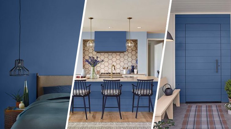
Want to work this color into your home decor? Check out these gorgeous ways to embrace 2020’s cool blue hue.
Front door
If you’re into feng shui, blue is said to channel peace and a sense of calm. Blue also represents water in feng shui, and it’s an ideal shade if you’re a coastal homeowner, so try a coat on your front door.

Behr
Kitchen island
A fresh coat of blue on your kitchen island is a cheery addition to a more typical beige palette. And this blue can help hide scuff marks when your kids kick the island from their perches.

Behr
Bedroom
For a good night’s sleep, think blue (there’s a reason more bedrooms aren’t painted orange or red). Blue is restful, and the shade has even been shown to slow heart rate and respiration. Sweet dreams!

Behr
Accent wall
Create a fun contrast with an accent wall or half-wall. By painting this way, you’re adding visual interest to your room and mimicking a chair rail or wainscoting with just a little bit of paint.

Behr
Bathroom vanity
Refresh your loo with some cool blue on your bathroom vanity. This blue pops beautifully against walls in a shade of clay and a graphic black and white rug.

Behr
The post You Can See, Taste, and Even Hear Pantone’s 2020 Color of the Year appeared first on Real Estate News & Insights | realtor.com®.
source https://www.realtor.com/news/trends/pantones-color-of-the-year-for-2020-classic-blue/
No comments:
Post a Comment